
Recently in a UX writing and content design group, someone asked about for tips on writing for screen readers. I’ve been focused on UX writing for accessibility for the last year or more. So I posted a few quick thoughts, and as things often do, it got long enough to become a blog post.
My number one tip is to use a screen reader so you know what it vocalizes. It’s a little tricky to learn (remember that Control stops the implacable flow of words from it!) but it’s helpful to experience the page(s) as your user will.
Labels
A few quick tips about accessibility labels (aka aria-labels):
- Do you even need an accessibility label? Most things don’t, because the screen reader should vocalize all text on the screen. So mainly you need to watch out for elements like icon-only buttons or things that change. (More on both of those later.)
- If you need a label, here’s what to include and not include: Focus on describing the functionality or the task the user is trying to accomplish by interacting with that element. Labels typically don’t need to include what an element is or its state, because the screen reader will vocalize something like “Checkbox, checked” or “Collapsed list”. Also, labels should not be specific to one input method: avoid using “click”, “tap”, or “type”. For example, “Voice search” is better than “Tap to speak” for 2 reasons: first, the user may be using a keyboard or some assistive technology, so “tap” may not be applicable; and second, the main task is searching and not speaking.
- Keep your labels short! Something you may notice about the screen reader experience is that it can be a torrent of words. One axiom about UX writing is that “Short beats good”, and this is especially true for accessibility writing.
This video on writing great accessibility labels from WWDC 2019 is a great demonstration of the above.
Announcements
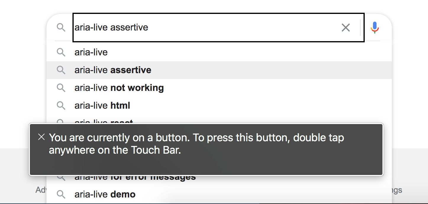
When something changes on the screen, there should be an announcement (aria-live). For example, when you start typing in a search bar and autocomplete options appear, or if you enter something in a form and a validation message appears — the screen reader (SR) user needs to know what’s happening.
Order and navigation
Be aware of what order screen reader (SR) users experience things in. Forms can be a problem because SR users often don’t experience the text below the form element until after they’ve tried to enter their information. So if there’s a tip like “Passwords must be at least 6 characters and include at least one number or punctuation mark”, SR users won’t “see” it until later. There’s a good example of this in Michael Metts’ and Andy Welfle’s article on writing accessibly.
Also, SR users often navigate by headings and links. (For example, here’s a description of using Web Rotor in Mac VoiceOver.) That means it’s important to have headings in a logical hierarchy: don’t use an H2 just because the font looks nice, if it should really be an H4 nested under the H3. And links need to tell the user where they’re going, and be distinct from each other. As Kinneret Yifrah mentions in her post about accessible microcopy under point 4, it doesn’t help someone to hear “View post” multiple times. At least make it “View post about XYZ”.
Bad elements
Some elements are not great for SR users: tooltips and placeholder text may not be vocalized. These are things you may need to work with engineers on. Your engineering team may be able to make sure the tooltip is accessible to SR users. They might be able to help with placeholders too, or you may want to rethink using them, since there are multiple problems with placeholders in forms.
Alt text for images
I left alt text for last because it is important, but sometimes people go overboard with it. As Penn State University recommends for alt text, “A good rule of thumb to consider is to include what you might relay over the phone.” And you may not need it if there’s accompanying text! Or if the image is purely decorative. For example, if I add a comment to a page and it says “Posted by Jina Chan” and includes a small profile picture, but the picture isn’t clickable, then that picture does not need alt text: it has accompanying text and no functionality.
Photo of a person using assistive technology by Sigmund on Unsplash
